


OPTIMIZED FORMS
Forms are the key to a landing page. Without them, there is no way to “convert” a visitor into a lead. Forms come in handy when it’s time for people to sign-up, subscribe to your site or download an offer.
The following tips will uncover how to build great landing page forms.
Every week, we will publish chapters from our ebook where we share tips, tricks and ideas for generating leads.
If you wish to get the full copy of the 32 Greatest Lead Generation Best Practices ebook now, click on the button below:

Now, let's dive in!
#22 The Right Form Length
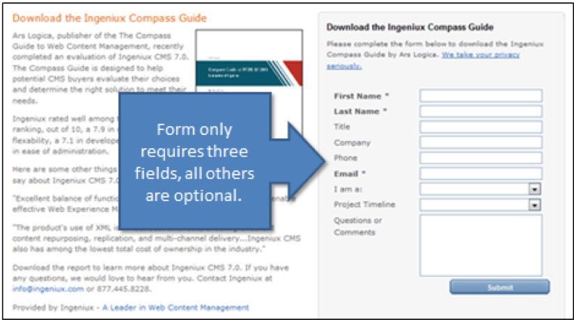
You might be wondering how much or how little information you should require with a form. There is no magic answer when it comes to how many fields your form should contain but the best balance would be to collect only the information you really need.
The fewer fields you have in a form, the more likely you will receive more conversions. This is because with each new field you add to a form, it creates friction (more work for the visitor) and fewer conversions. A longer form looks like more work and sometimes it will be avoided all together. But on the other hand, the more fields you require, the better quality those leads might be. The best way to determine what works best is to test it.
#23 To Submit or Not to Submit
That is the question most of your visitors are asking. One of the best ways to increase form conversion rates is to simply NOT use default word on your button: “SUBMIT.”
If you think about it, no one wants to “submit” to anything. Instead, turn the statement into a benefit that relates to what they are getting in return.
For example, if the form is to download a brochure kit, the submit button should say, “Get Your Brochure Kit.” Other examples include “Download whitepaper,” “Get your free ebook,” or “Join our Newsletter.”
Another helpful tip, make the button big, bold and colorful. Make sure it looks like a button (usually beveled and appears “clickable”).
 Don't do this!
#24 Reduce Anxiety With Proof-Elements
People are more resistant to give up their information these days, especially because of the increase in spam. There are a few different elements you can add to the form or landing page to help reduce a visitor’s anxiety to complete the form:
- Add a privacy message (or link to your privacy policy) that indicates their email will not be shared or sold.
- If your form requires sensitive information, include security seals, a BBB rating, or certifications so that visitors know their information is safe and secure.
- Adding testimonials or customer logos is another great to indicate social proof. For example, if your offer was for a Free Trial, you may want to include a few customer testimonials about your product or service.

Example of security seals at the bottom of a landing page form.
#25 Make the Form Appear Shorter
Sometimes people won’t fill out a form just because it “looks” long and time-consuming. If your form requires a lot of fields, try making the form look shorter by adjusting the styling.
For example, reduce the spacing in between fields or align the titles to the left of each field instead of above it so that the form appears shorter. If the form covers less space on the page, it may seem as if you’re asking for less.
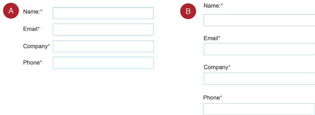
Both forms have the same amount of fields, but version A might look shorter than B on the page.
#26 Move Your Form Above The Fold
‘Above the fold’, a term inherited from traditional marketing, means the portion of a webpage or landing page that is visible without scrolling. This is the prime real estate that gets most of the attention from users. As it is highly visible, the content placed here should be attention grabbing and is the most important content to achieve your business objectives.
By placing your form above the fold, the visitor will be sure what the next step is, or how to get the promoted offer.
Curious to know other tips you can implement straightaway? Get our 32 Greatest Lead Generation Best Practices ebook now by clicking on the button below: